
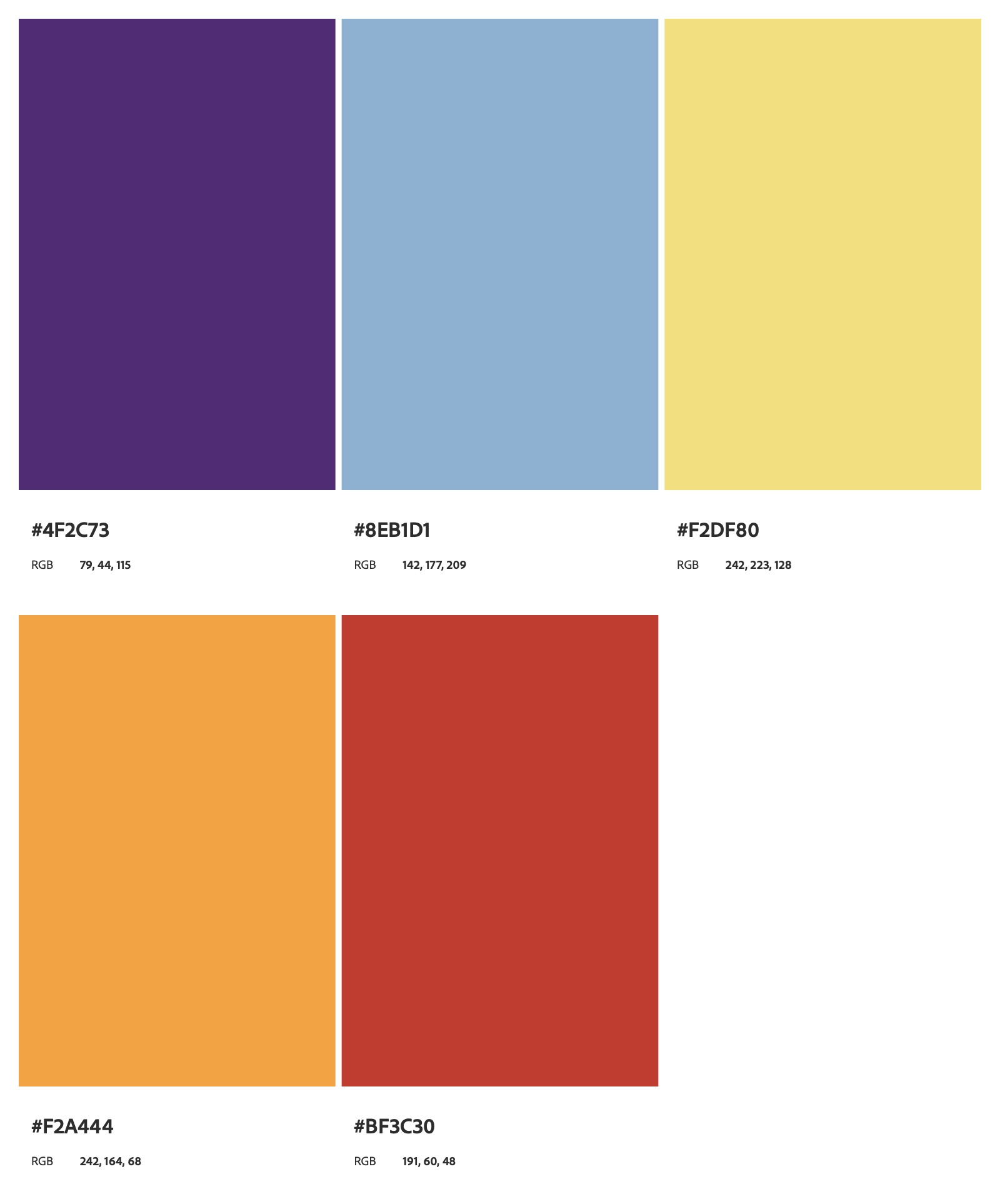
These hi-fi desktop home page prototypes were created for the King Island Festival to explore different visual directions for a festival website. As early design concepts, they demonstrate how layout, typography, and imagery can shape the user experience, from image-led storytelling to bold, text-focused communication. Together, they present flexible approaches to how the festival’s digital presence could be structured and experienced.
FOKI 26, hi-fi P R O T O T Y P E S
FOKI Home Page, hi-fi Prototype #1
Project Type:
Home Page Design
Client:
King Island Festival
A hi-fi landing page prototype for the King Island Festival that explores image-led design. The layout uses rounded geometric framing to highlight the festival atmosphere, guiding the viewer’s focus while introducing depth through layered elements. This concept prioritises visual engagement and a clear hierarchy between imagery, headings, and navigation.
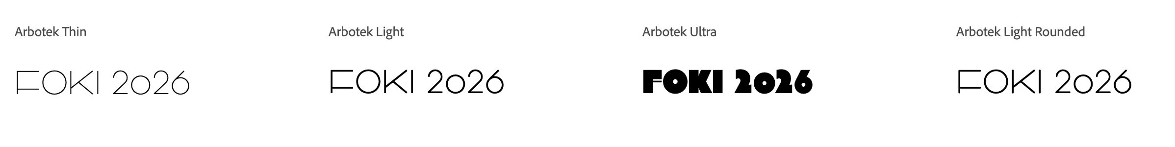
HEADINGS, Arbotek
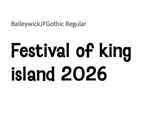
PARAGRAPHS, BaileywickJFGothic
FOKI Home Page, hi-fi Prototype #2
Project Type:
Home Page Design
Client:
King Island Festival
A hi-fi landing page prototype for the King Island Festival that focuses on bold typography and structured content. Large, expressive type establishes strong visual impact, while supporting text and imagery are arranged to communicate key festival information clearly. The design balances playfulness with readability, offering a more direct and informative approach.
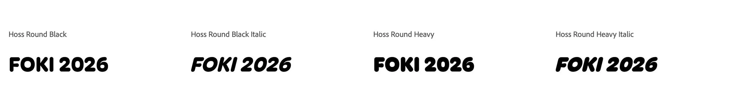
HEADINGS, Hoss Round
PARAGRAPHS, BaileywickJFGothic
Through developing these prototypes, I explored the balance between visual storytelling and clarity. One direction focuses on capturing the energy of the festival through imagery, while the other prioritises strong, immediate communication through typography. This process reinforced the importance of designing with both emotion and function in mind.