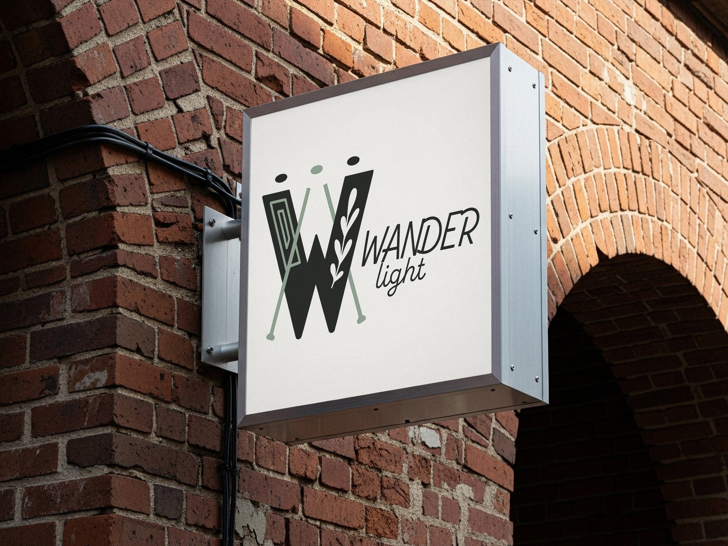
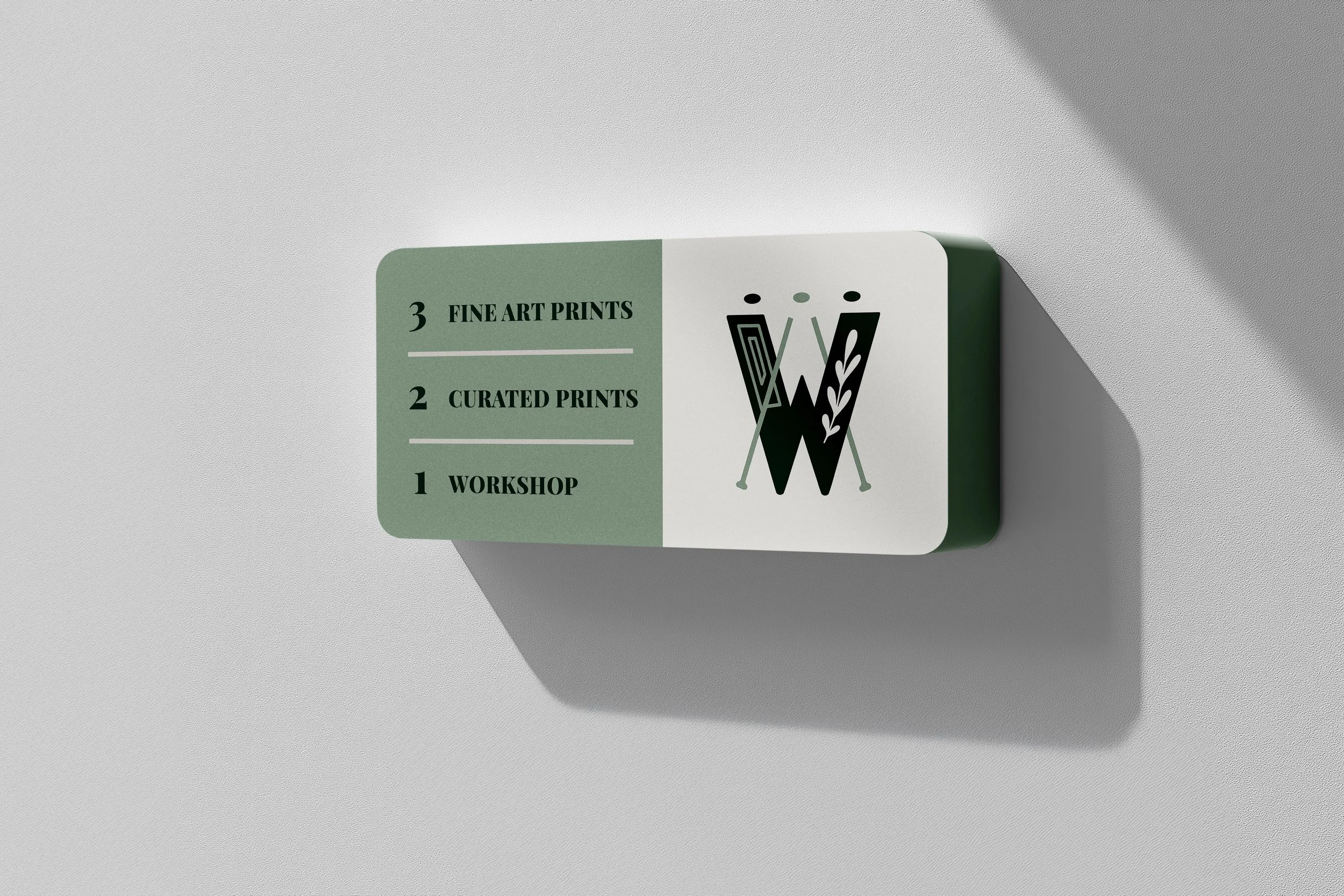
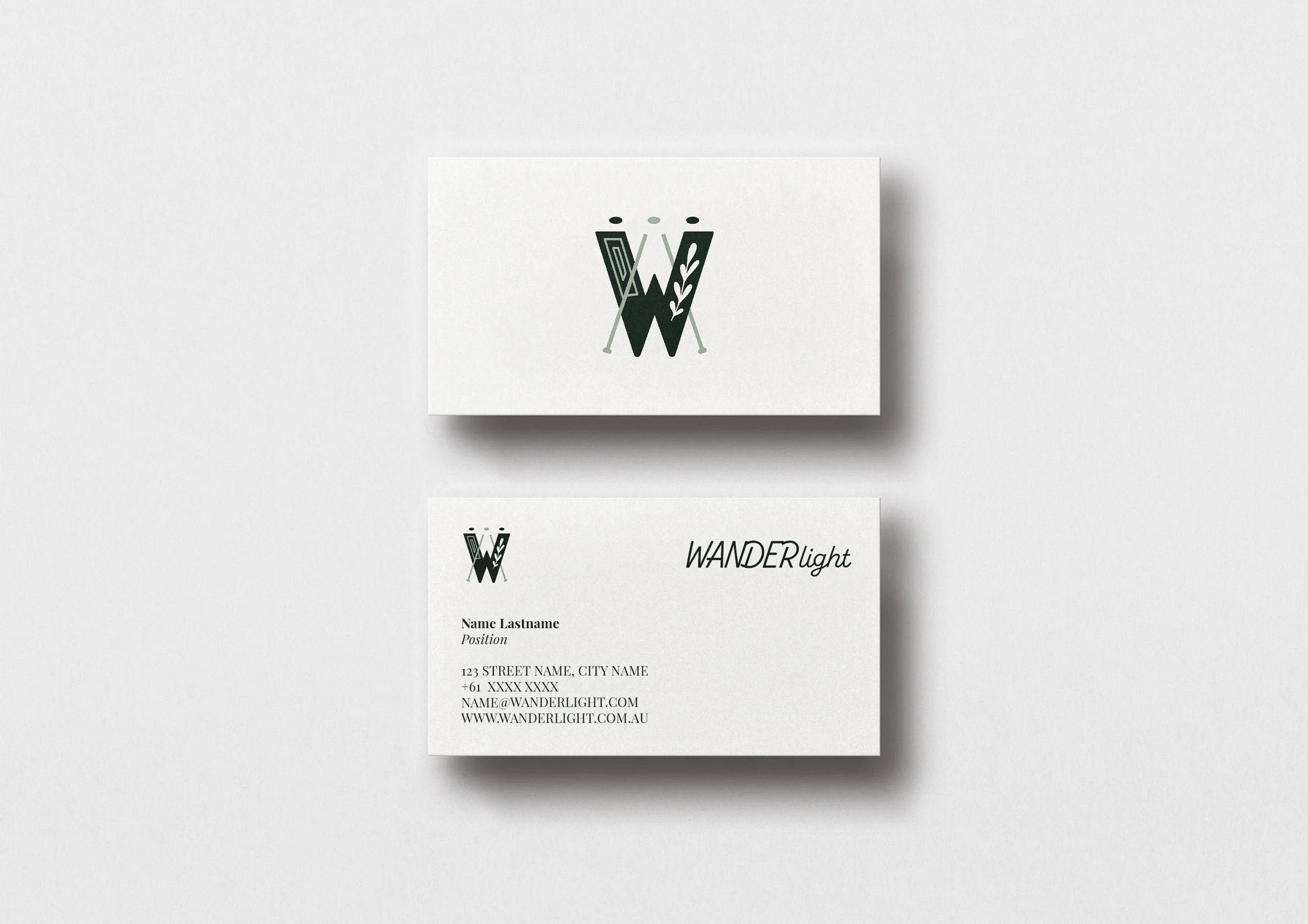
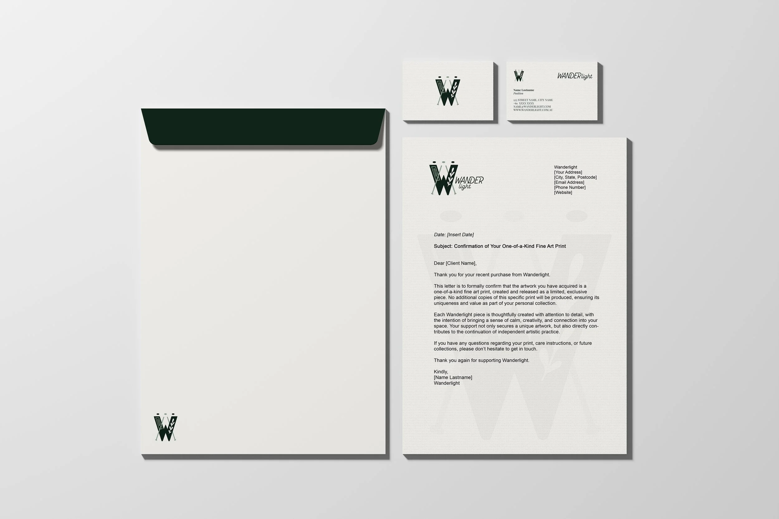
Offering curated art and photography prints, Wanderlight’s logo and brand identity were created to reflect three guiding principles: Connection, Whimsy, and Grace. Connection brings people and stories together. Whimsy invites a gentle escape into imaginative, dreamlike spaces. Grace ensures each composition balances elegance and approachability, creating a visual identity that is timeless, thoughtful, and playful. Ultimately, this is a personal brand with a personal artistic touch.

WANDER L O G O

Logo with the words "Wander light" and stylized crutches or hiking poles.
Stylized monochrome representation of the word "WED" with a leaf design and two crossed syringes behind it.

geometric frame representing curated, high-quality framed prints at the heart of ‘Wanderlight.’

ABSTRACT FRAME -

Close-up of a minimalist black and gray paperclip with a paperclip in the background.

soft, organic leaf symbolising naturalistic photography, calmness, and serene visual storytelling.

LEAF MOTIF -

Close-up of a stylized plant with white leaf shapes on a dark green background.

dual meaning, an easel-like form hinting at artistic creation, and three connected dots symbolising community and togetherness.

INTERTWINED LINES + 3 DOTS -

Stylized letter W with two walking crutches crossed behind it, featuring leaf and rectangle patterns in dark and light green.
Outdoor sign mounted on brick wall with the logo and text for 'Wander Light' featuring stylized letter 'W' with arrows and leaves.
White disposable plate with the Starbucks logo printed on it, featuring two crossed green straws and the Starbucks mermaid emblem.
Signboard with a green and white background, displaying three offerings: workshop, curated prints, and fine art prints, with a stylized abstract fern design.

IF YOU WISH TO VIEW ALL MY WORK COHESIVELY, VISIT MY SECOND PORTFOLIO HERE!