
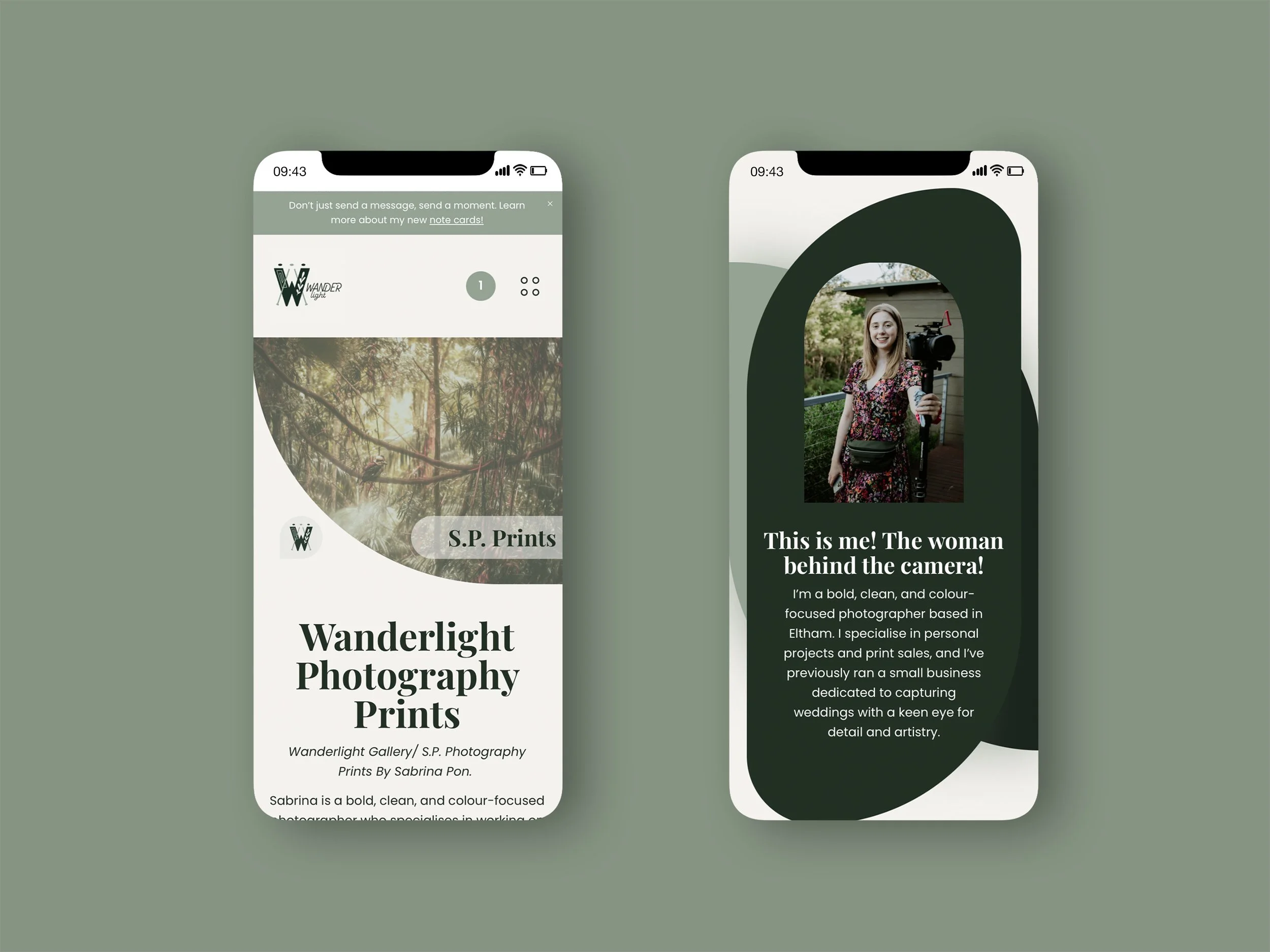
I designed the S.P. Photography Prints (Wanderlight Gallery) website to showcase and sell curated art and photography prints in a bold yet calming way. The site uses intentional colour choices including light neutrals, rich greens and muted sage to reflect the brand’s connection to nature, serenity and quiet sophistication. The layouts are clean and intuitive, allowing each artwork to take centre stage. Shapes and layered design elements echo the photographer’s creative style, inspired by the way she layers images in her work. Every decision from typography to spacing was made to create a peaceful, inspiring online experience that mirrors the artistic vision behind each collection.
WANDER W E B S I T E
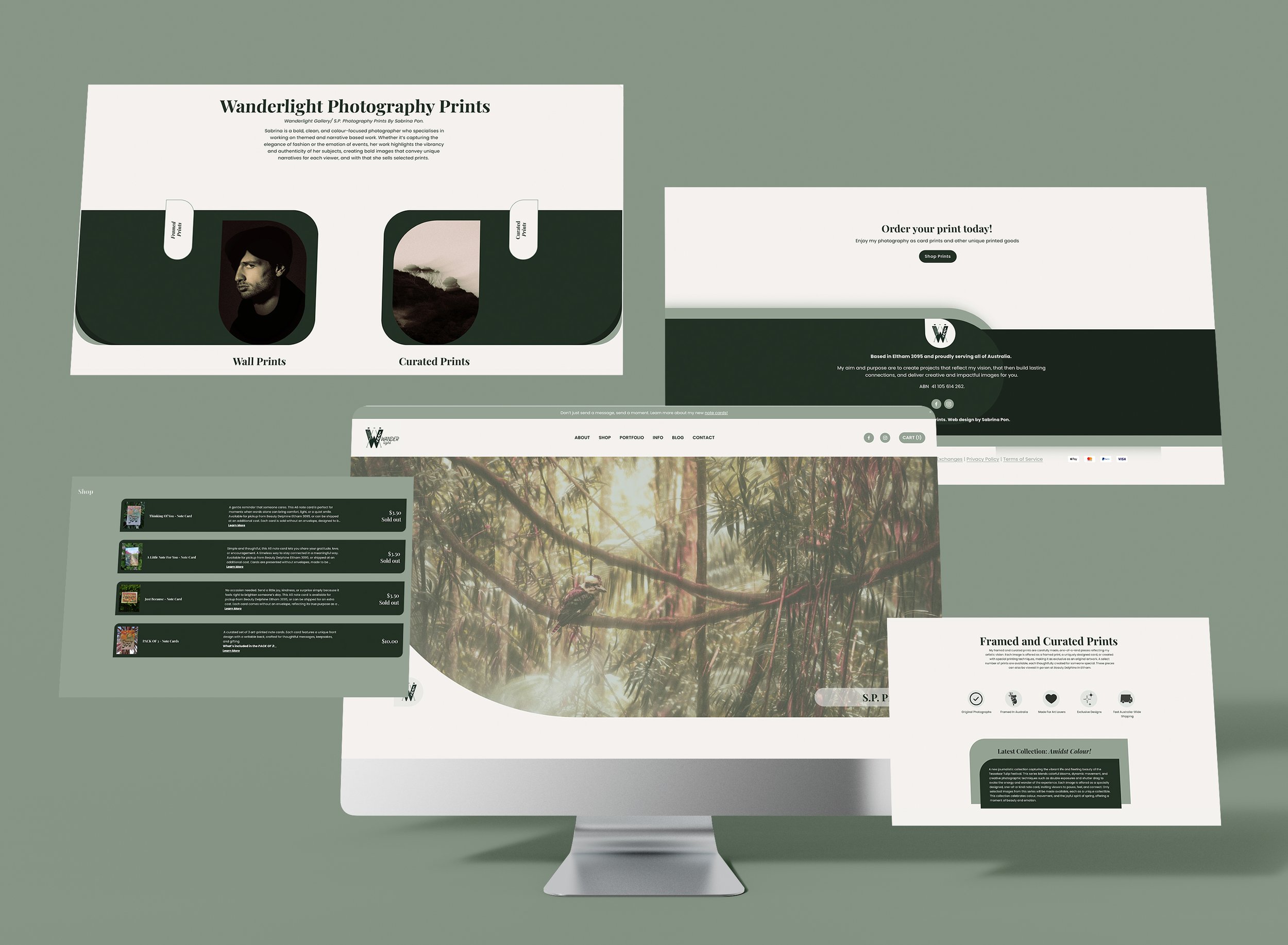
The rounded geometric shapes act as framing devices, guiding the viewer’s eye toward the photograph while breaking away from rigid grid structures. The layering creates subtle depth, separating content areas and establishing a clear visual hierarchy.

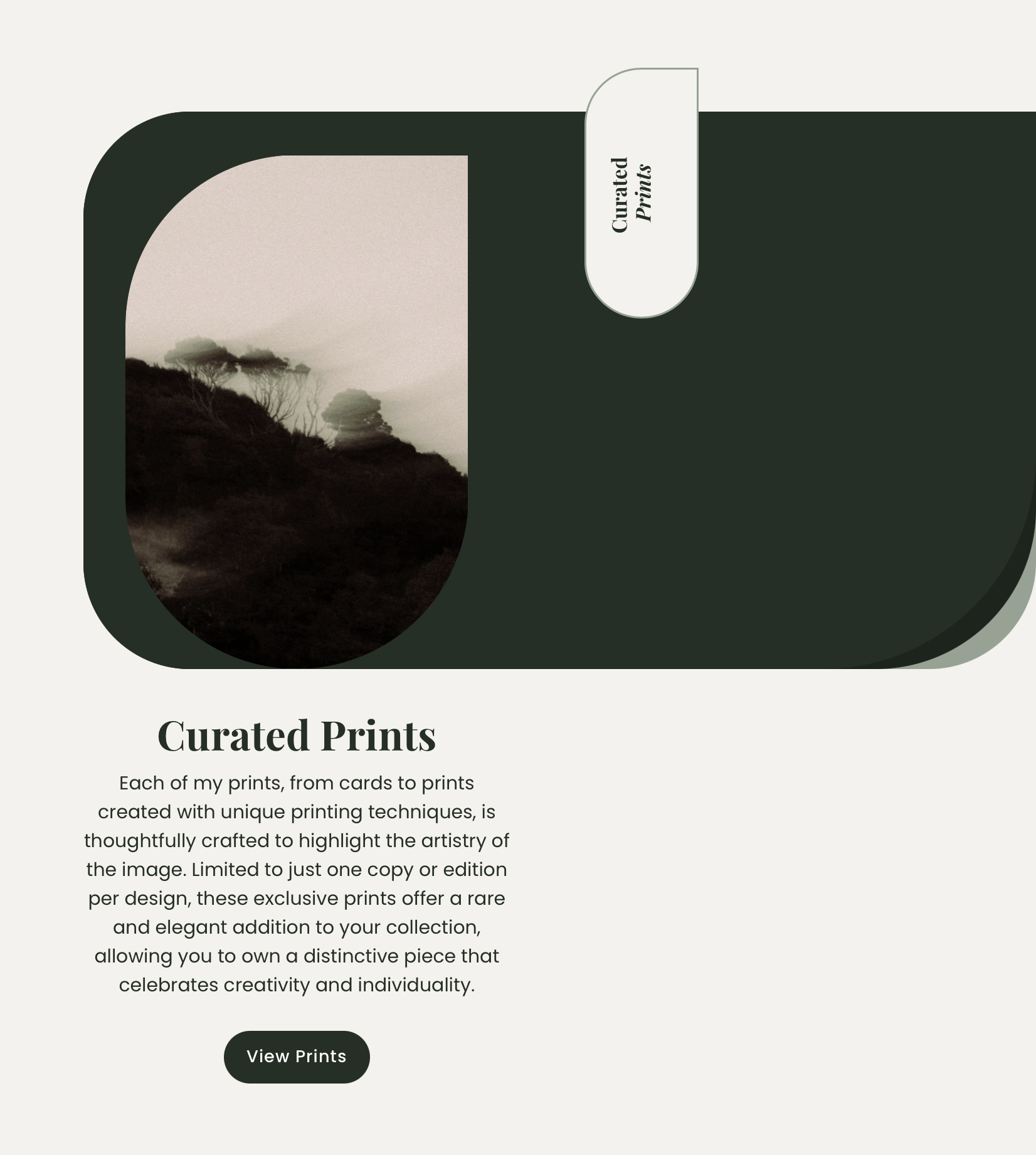
The curved container functions as a visual anchor, isolating the image and increasing focus. Its scale and darker tone create weight, allowing the photograph to stand out while reinforcing balance within the composition.
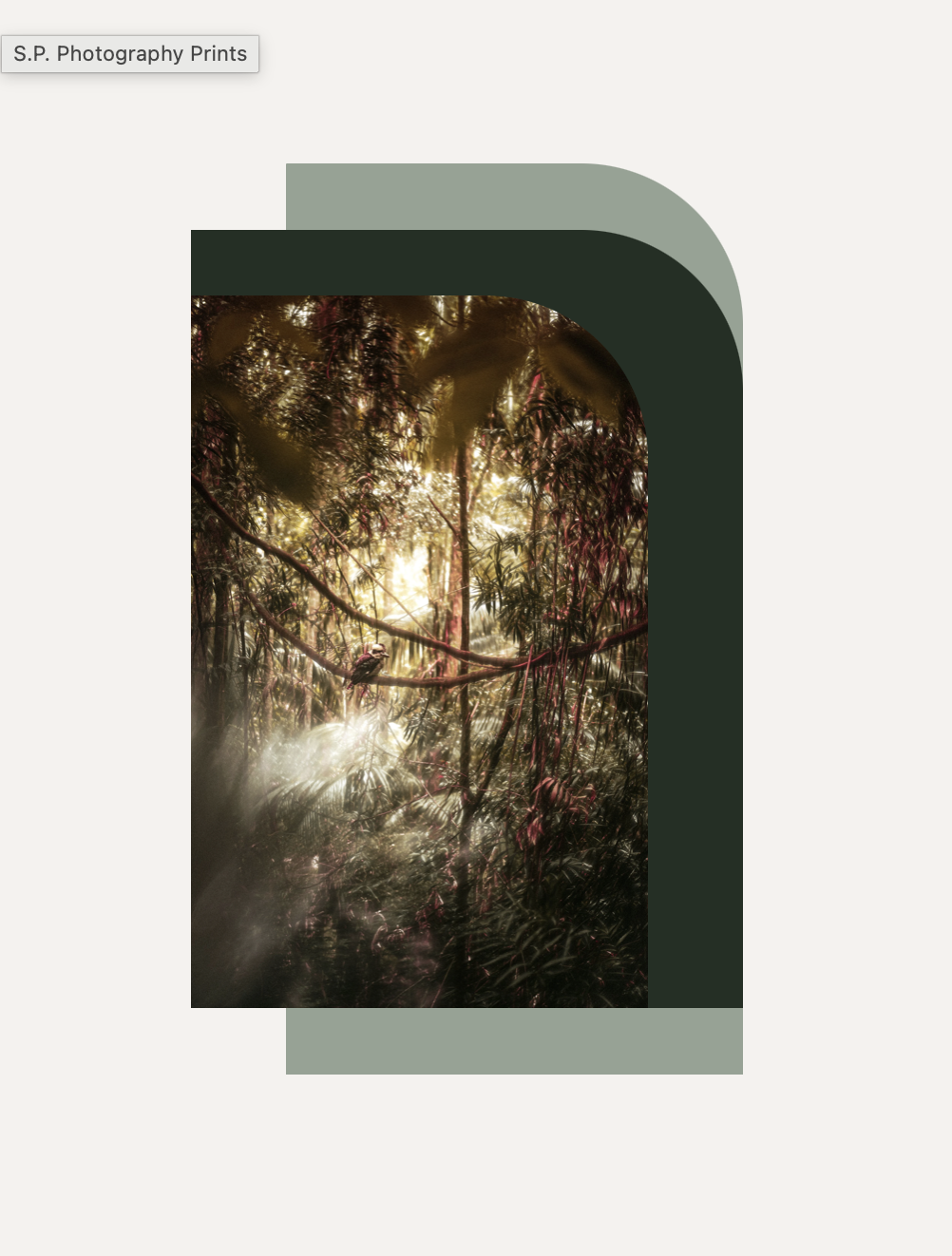
Overlapping shapes introduce spatial depth through contrast and stacking. The offset layers create movement and dimension, making the image feel embedded within the layout rather than flat on the page.
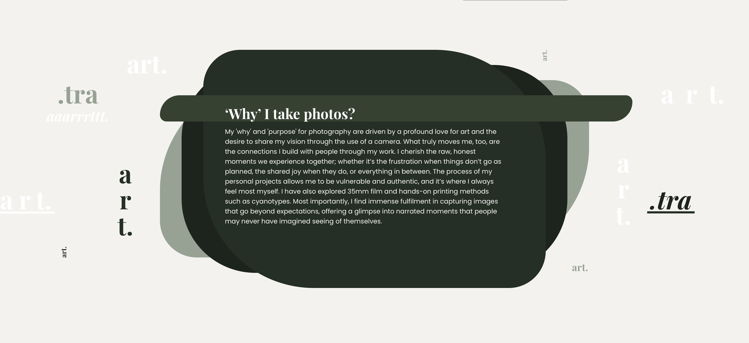
Layered forms behind the text create separation between foreground and background, improving readability while adding dimensionality. The shapes function as both a compositional anchor and a consistent visual motif across the layout.